ConnectWay App and Responsive Website
-
The Goal
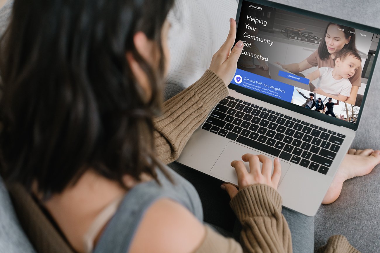
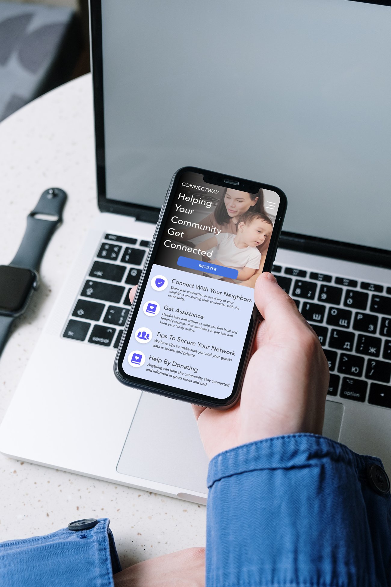
The goal of the project was to create Mobile App, Website and Mobile Website for the community. This service is called ConnectWAY and they offer a unique service of allowing neighbors to share their internet with others that may not be able to pay.
-
The Challenge
This website while meant to be a utility still needed to show things I learned throughout my Google course - and staying mindful of accessible contrasts and fonts. Along with that keeping consistency between all 3 designs - Web, Mobile Web and Mobile App.
-
My Role
UX Design
Research
User Testing
Graphics
Personas
The Personas represented in this project are synthesized from some friends along with a few I worked out with my friend who is a social worker. I spent some time thinking about these different people and how they live in their neighborhood. I based some the personas from personal experience living in the center of the city here in Providence, RI as well. Discovering their real problems will help the ConnectWAY page serve the community if it was to go further. I am determined to add a few more and nurture this site because I feel it is a good idea.
Sketches
I was struggling to think of how to make this utility page a little more exciting. Crazy 8’s and some google image searching helped but I spent a lot more of my time working on the flow hoping the inspiration for a decent layout would come along.
Wireframes
My wireframe work was short - I skipped to a more Lo-Fi version pretty quickly in an effort to spark more imagination. As the site was at the time it was a very linear unimaginative looking site. Also like my previous project it was missing a little bit of modern flash.
Low Fi Prototype
Moving into the Low Fidelity prototype I really was envisioning a flat look with icon driven bullets and links. Ultimately I found the flat look to be a little dull so I started working with some more drop shadow and blur levels. This project I worked on leaving more dead space too.
Research
I really knew where the site was going in a functional direction, but similar to my last project the “GameAwards” it lacked the modern look - lots of sharp corners and color clashes. I spent some time researching non-profits to see how they managed to keep attention to the page at the same time keeping their message clear. I found the Unicef website along with a few others helpful in thinking through not only bits of pop the page needed to feel comfortable, but also project community.
Testing
The user tests for the low fidelity prototype were very positive. The flows that were created to test the process of signing up and completion were 100% with 5 testers of varying skill.
After getting the High Fidelity prototype into testing, there were numerous problems with the website for fonts being too small. I spent time connecting some dead ends in the new prototype and fixing all of the colors to be within WCAG guidelines. It doesn’t pop as much in color however the importance is the information.
Accessibility
After going through my design with the Stark plugins I found a lot of accessibility issues, especially in contrast.
I adjusted several of the original colors that I had designated for the palette. In doing that I ended up finding a more visually pleasing color way. I added some gradients to so of the elements to allow the white elements to still pop above the backround, especially around the navigation menu.
The Results
-
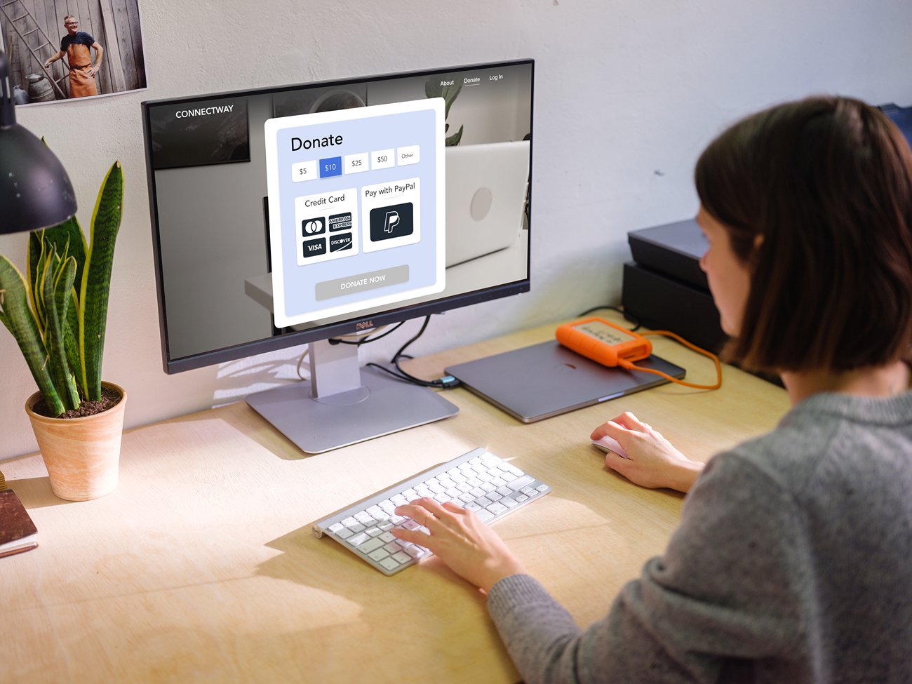
Checkout
The checkout is fast and clear.

-
Landing Page
Adding a slide show to the front page really ended helps convey the emotional link.

-
The Aesthetic
I found the monochromatic blue approach to make this website really feel like a useful utility. I took a lot of cues from my previous work and created some low res video slide shows to really drive home the feeling of community.

Takeaways and Lessons
Start with Small Screens - I started with big screens and tried to bring them to the app or mobile app sizes. While this graceful degradation may work for other designers, I really liked the negative spaces that I started getting
Leave negative space - I still don’t like negative space. I will continue to find the right places to utilize negative space.
Continue to Experiment in Color - I set out with a color palette in mind and it did not work. I spent time finding inspiration at Colorinspo.io - a great palette building page that has already inspired more thoughts about what I can do.
Reactive Webpage - Making the webpage feel alive was a part of my goal and I think I hit that. Through transitions the dedicated application really pops.
Wrapping Up My Course Work - This project is the end of my Google UX Design Course. After being in design for years I finally feel like a designer with proper chops. I spent a lot of time educating myself over the years and seeing other designers working the same way makes me feel validated and ready to get out and solve problems for humans!


